Where People Drink the Most Wine, Beer and Spirits

Back in 2014, fivethiryeight.com published an article on alchohol consumption in different countries. I analyse and plot consumption of beer, wine and spirits by country.
First, we’ll make a plot that shows the top 25 beer consuming countries.
#Let's create a dataframe where we'll store the top 25 beer consuming countries, we'll measure that by beer servings.
top_countries_beer_servings <- alcohol_direct %>%
  group_by(country) %>%
  arrange(-beer_servings) %>%
  head(25)

#Next, let's create our plot. For this, we'll use ggplot2() from the dyplr package.
beer_plot <- ggplot(top_countries_beer_servings, aes(x= beer_servings, y= fct_reorder(country, beer_servings))) +
  geom_col(fill="red4", alpha=0.5) +
  theme_bw() +
  labs(
    title = "Top 25 countries by beer servings",
    subtitle = "",
    x = "Beer Servings consumed per capita",
    y = NULL
  ) +
  NULL

beer_plot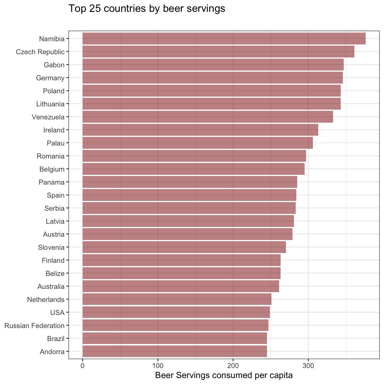
Next, we’ll do the same for the top 25 wine consuming countries.
#Again, we're creating a dataframe where we're ordering the top 25 wine consuming countries.
top_countries_wine_servings <- alcohol_direct %>%
  group_by(country) %>%
  arrange(-wine_servings) %>%
  head(25)

#And create a new plot, but this time, let's add another color.
wine_plot <- ggplot(top_countries_wine_servings, aes(x= wine_servings, y= fct_reorder(country, wine_servings))) +
  geom_col(fill="red3", alpha=0.5) +
  theme_bw() +
  labs(
    title = "Top 25 countries by wine servings",
    subtitle = "",
    x = "wine Servings consumed per capita",
    y = NULL
  ) +
  NULL

wine_plot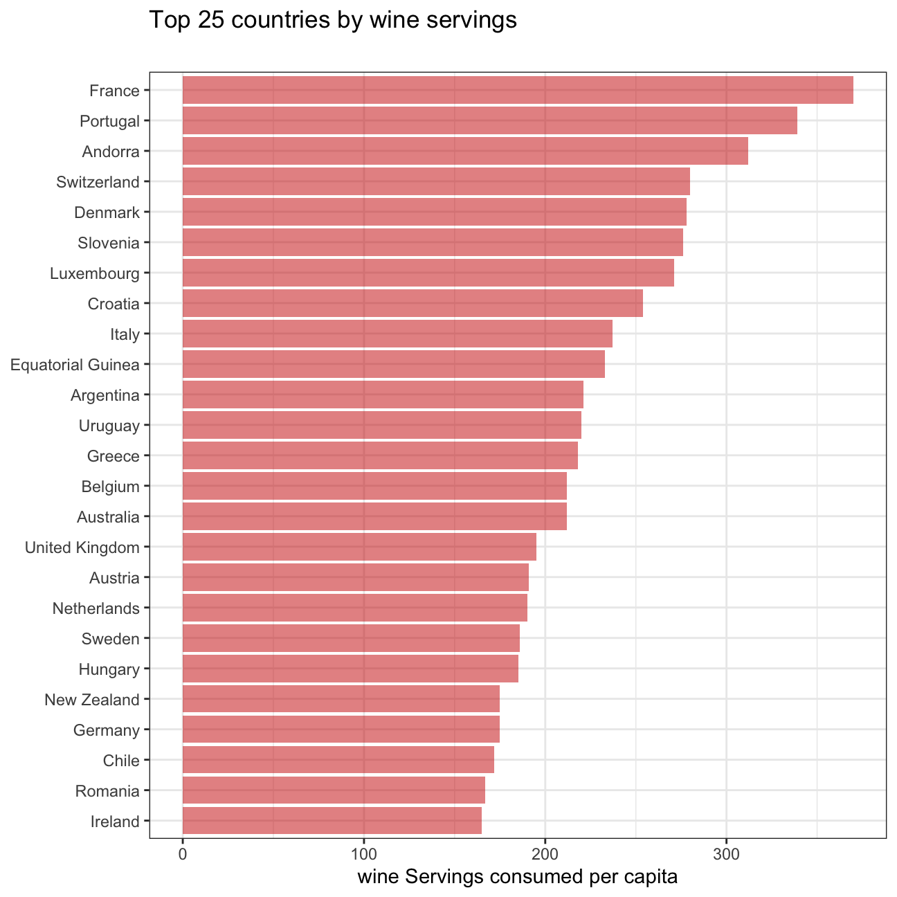
Finally, we make a plot that shows the top 25 spirit consuming countries.
#Let's create another dataframe, specifically for spirit consuming countries.
top_countries_spirit_servings <- alcohol_direct %>%
  group_by(country) %>%
  arrange(-spirit_servings) %>%
  head(25)

#And then... you guessed it... we'll plot our results.
spirit_plot <- ggplot(top_countries_spirit_servings,
                      aes(x= spirit_servings, y= fct_reorder(country, spirit_servings))) +
  geom_col(fill="red2", alpha=0.5) +
  theme_bw() +
  labs(
    title = "Top 25 countries by spirit servings",
    subtitle = "",
    x = "spirit Servings consumed per capita",
    y = NULL
  ) +
  NULL

spirit_plot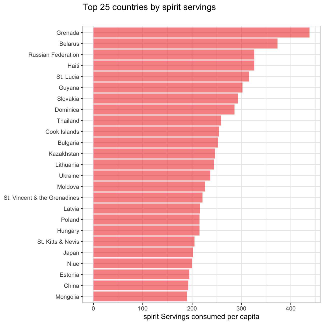
#Lastly, let's plot them next to eachother to make analysis easier
beer_plot <- beer_plot + geom_col(fill = "red4", alpha=0.5)
wine_plot <- wine_plot + geom_col(fill = "red3", alpha=0.5)
spirit_plot <- spirit_plot + geom_col(fill = "red2", alpha=0.5)

ggarrange(beer_plot, wine_plot, spirit_plot,
                    ncol = 3, nrow = 1)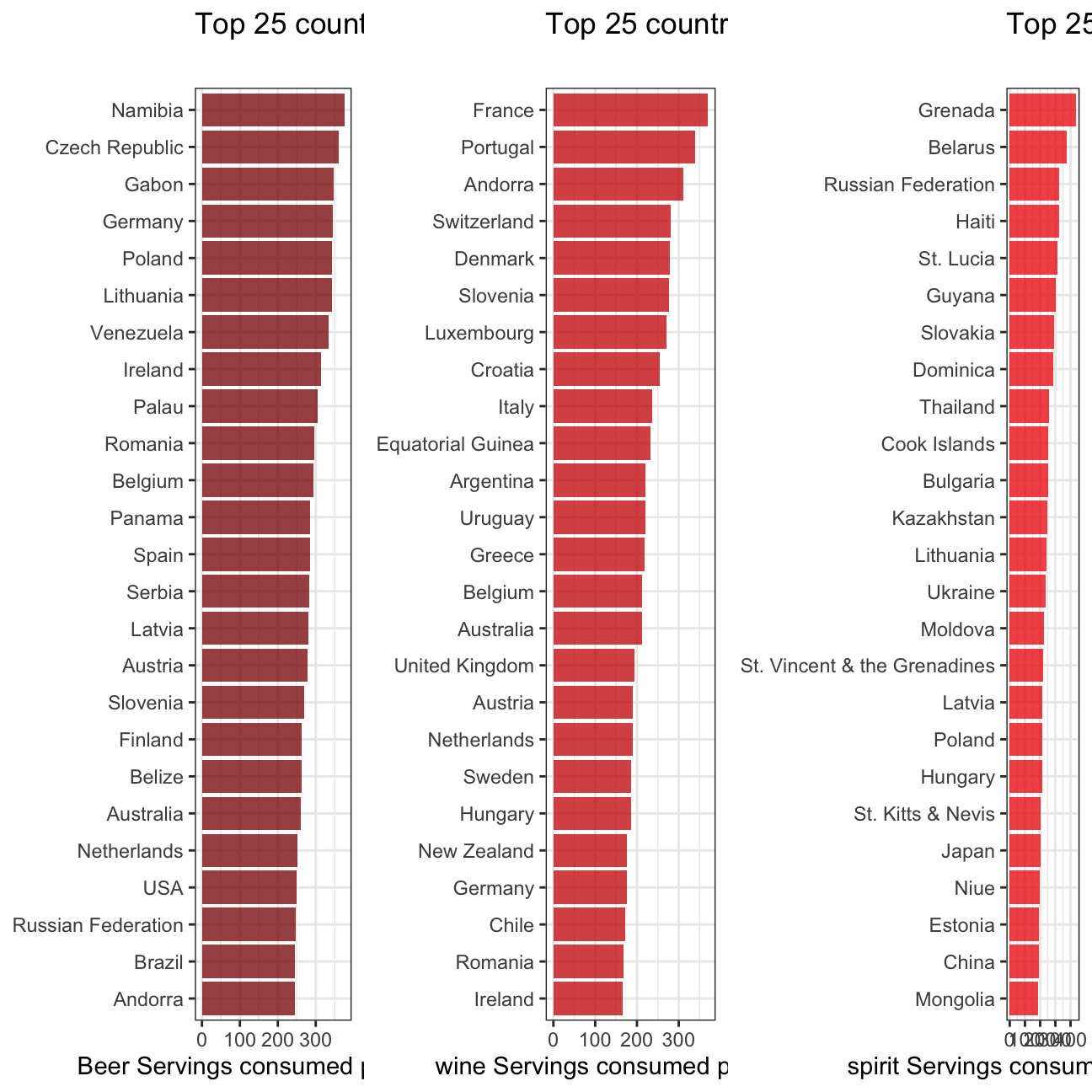
So what can we infer from these plots?
First we notice that European countries tend to consume more wine and beer than spirits. It is surprising to see that Germany is only number 4 in the beer consumer ranking behind Gabon, Namibia…