London Bike Rentals over Time

TfL releases data on how many bikes were hired every single day. We can get the latest data by running the following
url <- "https://data.london.gov.uk/download/number-bicycle-hires/ac29363e-e0cb-47cc-a97a-e216d900a6b0/tfl-daily-cycle-hires.xlsx"

# Download TFL data to temporary file
httr::GET(url, write_disk(bike.temp <- tempfile(fileext = ".xlsx")))
## Response [https://airdrive-secure.s3-eu-west-1.amazonaws.com/london/dataset/number-bicycle-hires/2021-08-23T14%3A32%3A29/tfl-daily-cycle-hires.xlsx?X-Amz-Algorithm=AWS4-HMAC-SHA256&X-Amz-Credential=AKIAJJDIMAIVZJDICKHA%2F20210915%2Feu-west-1%2Fs3%2Faws4_request&X-Amz-Date=20210915T152225Z&X-Amz-Expires=300&X-Amz-Signature=345cc72bacd9913fb660455821cc29cd67559a4c72b1bbcd2378a61a2cf2ccfc&X-Amz-SignedHeaders=host]
## Date: 2021-09-15 15:26
## Status: 200
## Content-Type: application/vnd.openxmlformats-officedocument.spreadsheetml.sheet
## Size: 173 kB
## <ON DISK> /var/folders/s6/8k1l8qyx5qn2pzl_txp7k4sm0000gn/T//RtmpdY85ir/file175412d9c9340.xlsx# Use read_excel to read it as dataframe
bike0 <- read_excel(bike.temp,
sheet = "Data",
range = cell_cols("A:B"))
# change dates to get year, month, and week
bike <- bike0 %>%
clean_names() %>%
rename (bikes_hired = number_of_bicycle_hires) %>%
mutate (year = year(day),
month = lubridate::month(day, label = TRUE),
week = isoweek(day))We can easily create a facet grid that plots bikes hired by month and year.
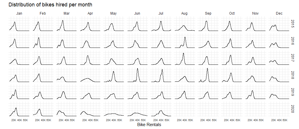
We can see that in the month of May and June 2020, bike rentals went down immensely, compared to previous years. This can be attributed to the national lockdowns that were enforced due to the COVID-19 pandemic during that time.
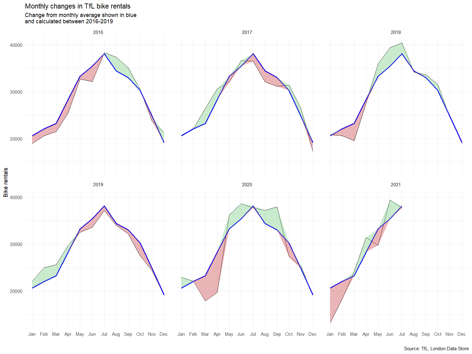
Let’s recreate the following graph:
#Let's create dataframes to filter out certain years and organise them by months.
 general_monthly_average <- bike %>%
  filter(year>=2016 & year<=2019) %>%
  group_by(month) %>%
  summarise(general_monthly_average = mean(bikes_hired))

monthly_average <- bike %>%
  filter(year>=2016) %>%
  group_by(year, month) %>%
  summarise(monthly_average = mean(bikes_hired),
            year = unique(year))
#Let's now join these dataframes.
full_monthly_averages <- left_join(monthly_average, general_monthly_average, by="month")

#Lastly, let's recreate the plots using ggplot2(), and specifically geom_line and geom_ribbon. Let's also facet_wrap these by year so that we can see yearly changes.
full_monthly_averages %>%
  ggplot(aes(x=month, group=1)) +
  geom_line(aes(y=monthly_average)) +
  geom_line(aes(y=general_monthly_average),
            color = "blue",
            size=0.8) +
  geom_ribbon(aes(ymin = ifelse(general_monthly_average > monthly_average, general_monthly_average, monthly_average),
                  ymax = general_monthly_average),
              fill = "palegreen3",
              alpha = 0.5)+
  geom_ribbon(aes(ymin = ifelse(general_monthly_average <= monthly_average, general_monthly_average, monthly_average),
                  ymax = general_monthly_average),
              fill = "lightcoral", alpha = 0.5) +
  facet_wrap(~year) +
  labs(title = "Monthly changes if Tfl bike rentals",
       subtitle="Change from monthly average shown in blue \nand calculated between 2026-2019",
       y = "Bike rentals",
       x = "Months"
  ) +
  theme_minimal() +
  theme(
    axis.text.x = element_text(size = 6),
    axis.text.y = element_text(size = 6)
    ) +
  NULL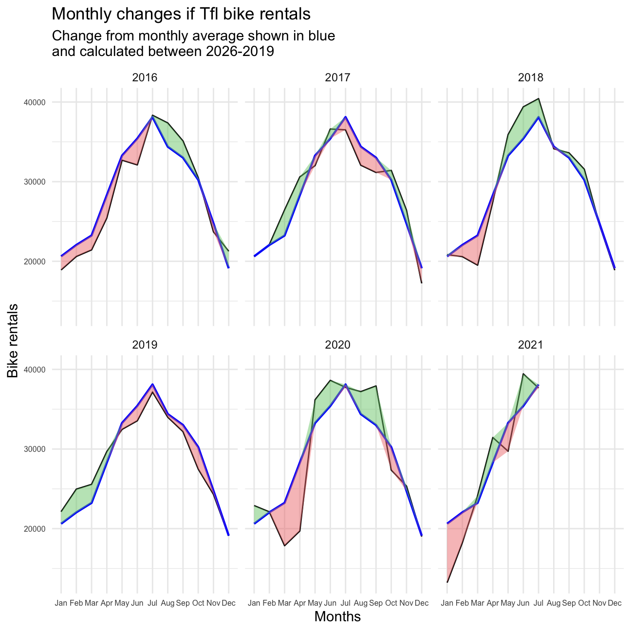
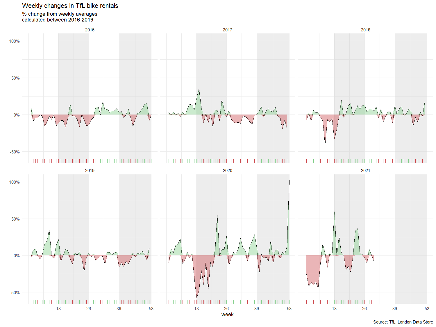
The second one looks at percentage changes from the expected level of weekly rentals. Let’s also recreate it.
#Let's create a dataframe to filter out certain dates and organize them by week.
expected_bike_pw <- bike %>%
  filter(day >= as.Date("2016-1-1") & day <= as.Date("2019-12-31")) %>%
  group_by(week) %>%
  summarise(expected_rentals = mean(bikes_hired))

#Next, we organize by year and week and join both dataframes.
bike_pw <- bike %>%
  filter(year >= 2016 & !(year == 2021 & week > 30)) %>%
  group_by(year, week) %>%
  summarise(actual_rentals = mean(bikes_hired)) %>%
  left_join(expected_bike_pw, by="week") %>%
  mutate(excess_rentals = actual_rentals - expected_rentals,
         excess_rentals_inpct = excess_rentals/expected_rentals)
#Lastly, we plot our data.
weekly_plot <- bike_pw %>%
ggplot(aes(x = week)) +
geom_line(aes(y = excess_rentals_inpct),
color = "black",
size = 0.1) +
geom_ribbon(aes(ymin = ifelse(excess_rentals_inpct > 0, 0, excess_rentals_inpct),
ymax = excess_rentals_inpct),
fill = "green4", alpha = 0.3) +
geom_ribbon(aes(ymin = ifelse(excess_rentals_inpct > 0, excess_rentals_inpct, 0),
ymax = excess_rentals_inpct),
fill = "red", alpha = 0.3) +
geom_rug(color = ifelse(bike_pw$excess_rentals_inpct > 0 , "green", "red"),
alpha = 0.5,
size = 0.3) +
annotate("rect",xmin = 13, xmax = 26, ymin = -Inf, ymax = Inf, fill = "grey", alpha = 0.3) +
annotate("rect",xmin = 39, xmax = 53, ymin = -Inf, ymax = Inf, fill = "grey", alpha = 0.3) +
scale_y_continuous(labels = scales::percent) +
scale_x_continuous(breaks = seq(13,53,by=13)) +
facet_wrap(~year) +
theme_minimal() +
theme(plot.title = element_text(size=7, face="bold"),
plot.subtitle = element_text(size=6, face="bold"),
axis.text.y = element_text(size=5),
axis.text.x = element_text(size=5),
axis.title.x = element_text(size=5, face="bold"),
strip.text = element_text(size=5),
plot.caption = element_text(size=5),
panel.grid.major = element_line(size=0.1),
panel.grid.minor = element_line(size=0.1)) +
labs(title = "Monthly changes in TfL bike rentals",
subtitle = "% change from weekly averages \n calculated between 2016-2019",
y = "",
x = "week",
caption = "Source: TfL, London Data Store")
weekly_plot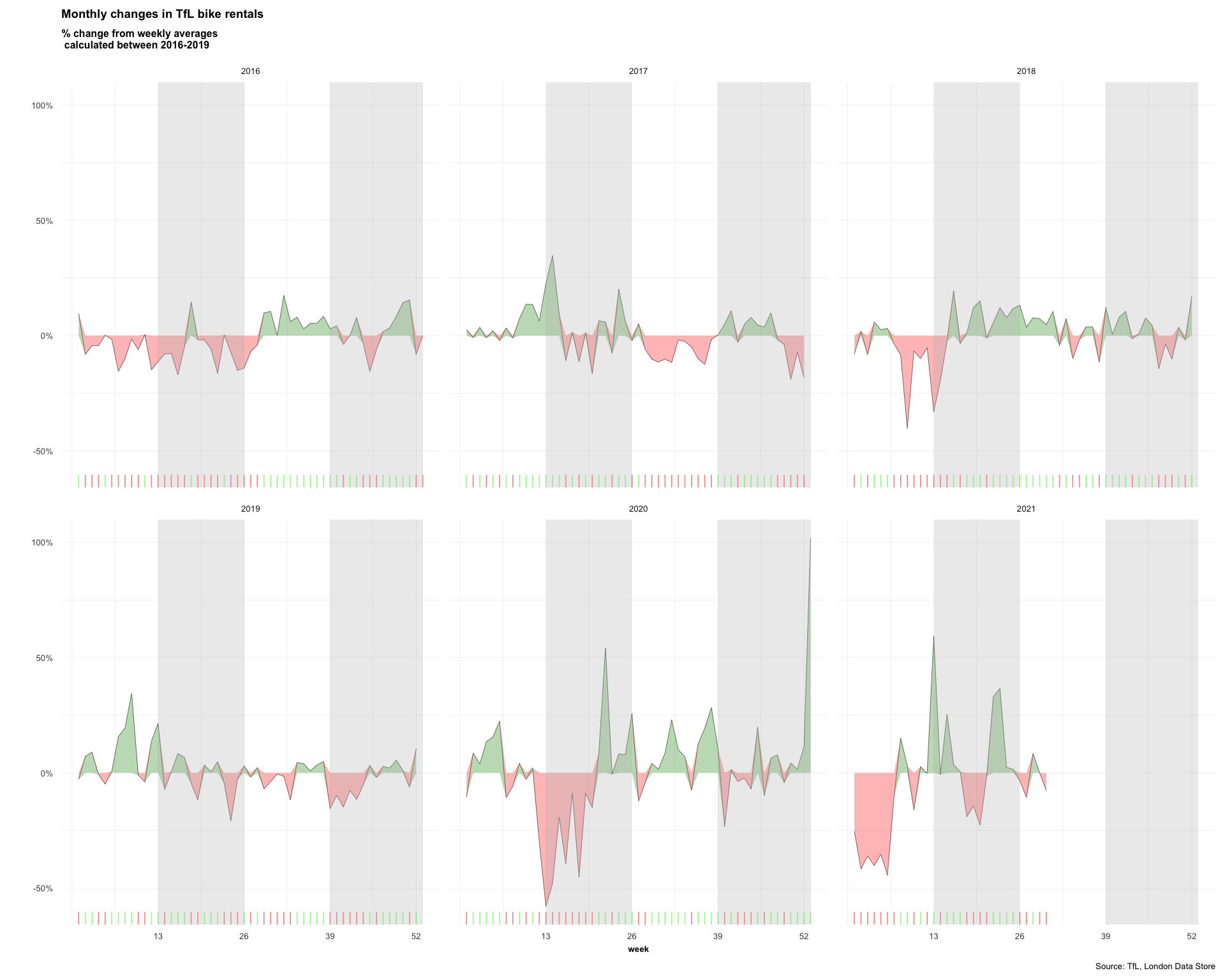
For both of these graphs, we to calculate the expected number of rentals per week or month between 2016-2019 and then, we see how each week/month of 2020-2021 compares to the expected rentals. Think of the calculation excess_rentals = actual_rentals - expected_rentals.
Note: We can see massive spikes in the previous graph, so it might be more useful to use the median rather than the mean, as extreme values won’t affect it as much.